Jeff Paul / Product Designer & Researcher
Redesigning Zapier’s Editor,
a new vision for workflow automation
Zapier’s redesigned Editor
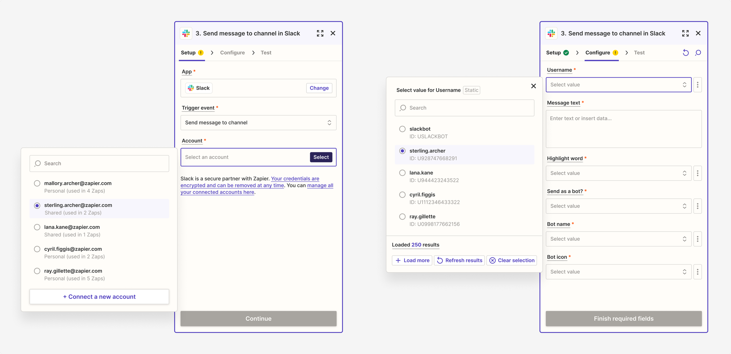
Role
Product Designer. Responsible for leading the vision and crafting all designs. Worked closely with product and engineering counterparts for shaping and delivery.
Team
Product Manager and Engineering Manager (core EPD), as well as 8 Engineers. Consulted with Executive Leadership, Director of Product Design, Director of Product, Lead Product Designer, Content Designer, UX Researcher, and numerous other stakeholders.
Timeline
2024. Q1 for visioning, initial designs, and team alignment. Q2 through early Q3 for engineering build. Ongoing refinement and iterations.
Context
Users and stakeholders both agreed: the Editor was long overdue for an upgrade
Zapier, a leader in the workflow automation space, had built their platform around a core product known as the Editor. Our product teams were a powerhouse, continually developing much-requested and increasingly powerful features for users. As more features were introduced to the Editor, however, the interface became bloated. Complexity creep prompted us to take a step back and reexamine the entire experience.
We had also heard a disproportionate amount of feedback from users commenting on not the features and functionality of the product, but instead its look and feel. Their sentiment was that the Editor felt clunky and cluttered when compared to similar automation tools. We recognized the need to raise our quality bar.
The Editor before the redesign
At the same time, we were fresh off the heels of a major brand refresh (one that felt disconnected from the product itself) and enduring the growing pains of maturing from a single to multi-product company. Part of this redesign became articulating a new visual language, one that would align with our new brand identity and lay the foundation for unification across all products in the Zapier ecosystem, including Tables, Interfaces, Canvas, Chatbots, and Functions.

Before and after Zapier’s brand redesign
Zapier’s product suite: Zaps (i.e. core workflow Editor), Tables, Interfaces, Canvas, Chatbots, Agents, and Functions
Ultimately, this project aimed to re-imagine the Editor. We wanted to address the UX debt that had accumulated over time, while also taking a future-looking approach to how we could modernize and elevate the UI of our product.
Problem
We needed to elevate our visual design standards, reduce clutter, and enable greater discoverability of core features
Our existing visual language was outdated. We felt competitive pressure from fresh upstarts that demonstrated powerful yet simple interfaces rife with new and more nimble usability patterns. We knew we could do better.
I noticed inconsistencies with color, typography, spacing, and a number of basic components like buttons and input fields. What’s more, our hierarchy and scale felt off (re: way too large), especially for such a complex and information-dense product. I wondered how I might simplify the Editor and craft a more thoughtful experience. I knew I needed to better organize the interface and think of what elements to prioritize, all while reducing visual noise.
Detail of bloated navigation
Detail of cluttered input fields
The notion of what to conceal and what to reveal had obvious impacts to our other goal: discoverability. In particular, there were about 30+ Zapier products and built-in tools critical for building a Zap that users often had trouble finding. How might I better differentiate between these products and tools from the 7,000+ third-party apps that Zapier integrates with? How might I better support beginner users while continuing to enable seasoned power users?
30+ Zapier products and built-in tools
Approach
Unfettered exploration, tempered by frequent feedback and incremental releases
I synthesized various insights to inform this work, including feedback from internal stakeholders, customer interviews, the team’s backlog, research reports in Dovetail, team-wide UX audits, and other proposals.
I then conducted a sweeping survey of the competitive landscape of automation workflow and canvas editor tools to gauge industry trends and best practices. I also sought out examples of other infinite canvas tools, like Figma, Felt, Spline, and Google Maps for further inspiration beyond our immediate industry.
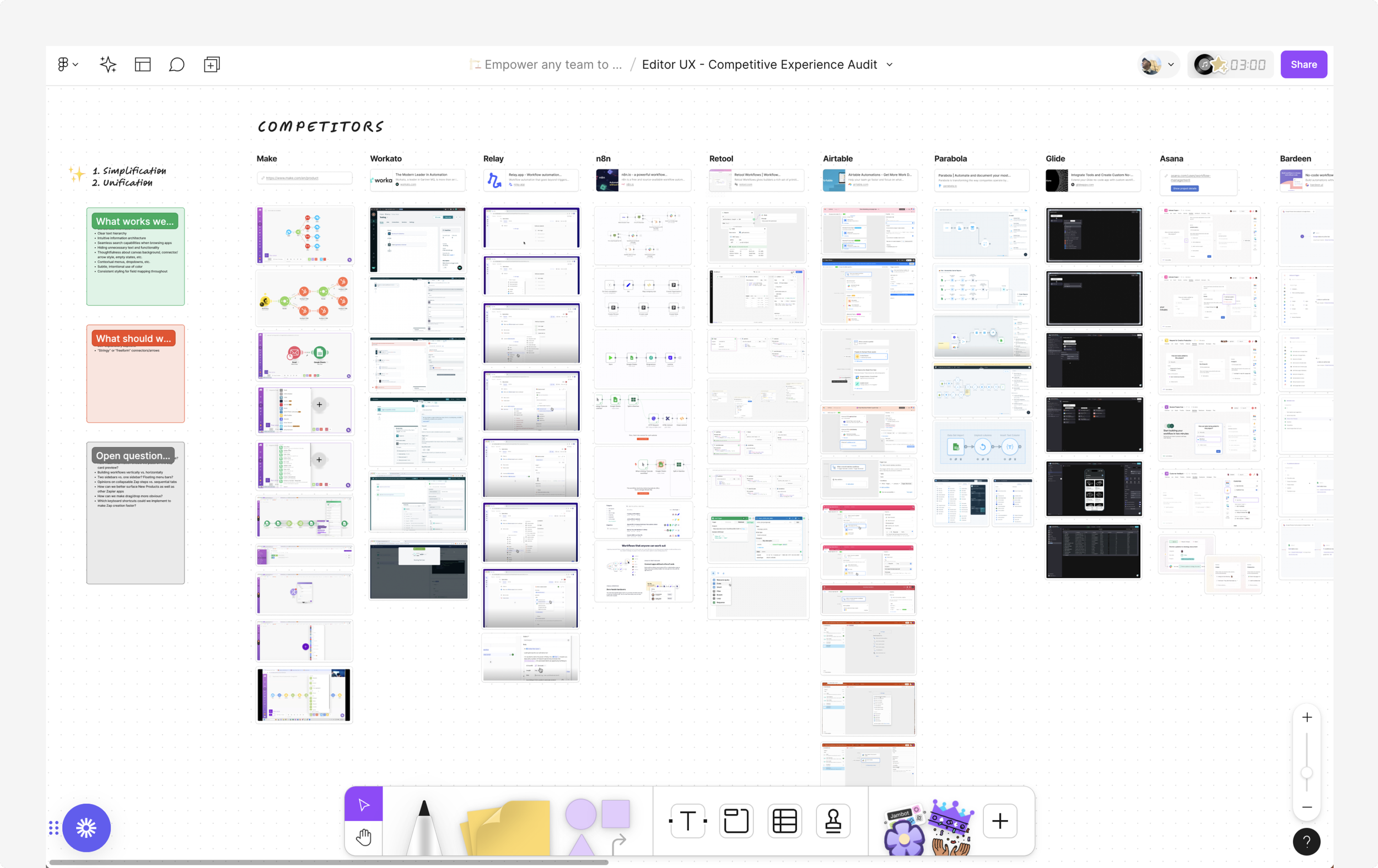
Close up of the competitive analysis conducted in Figjam
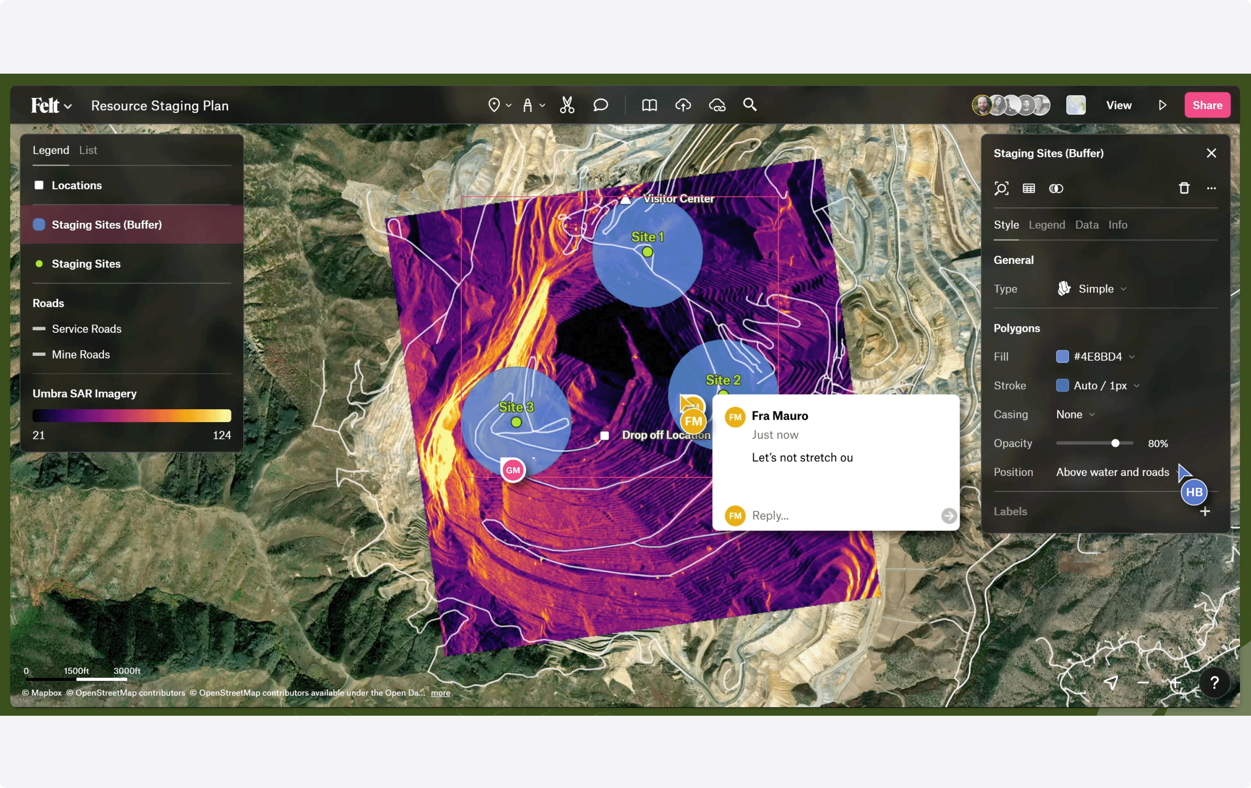
Felt interface, a source of inspiration
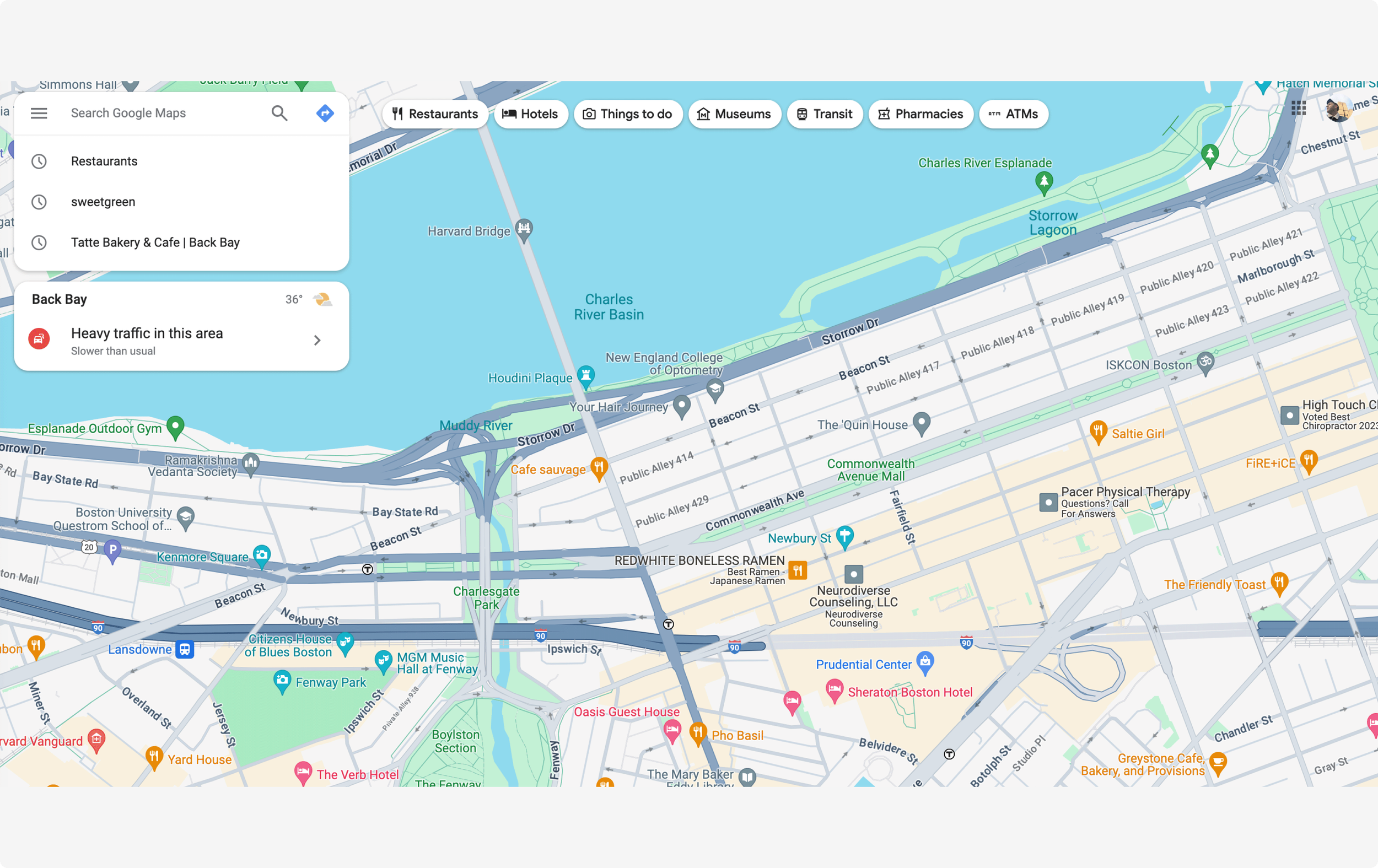
Google Maps interface, another source of inspiration
For such a comprehensive redesign, it was crucial to lead with a strong vision. I started with high-level concepts for a general direction to gain buy-in among stakeholders. Channel-wide Slack messages and Loom walkthrough videos helped circulate my ideas, spark conversations, and offer context to the Figma designs I was sharing.

Making extensive use of comments in Figma to solicit feedback from stakeholders
Once I crafted something we could all rally around (and after many rounds of feedback and design critiques with leadership), I did a deep dive into the details. I generated countless configurations of each section of the Editor: global navigation, sidebar, card styles and connectors, step details, and the app picker.
Detail of quick-access toolbar concept
Detail of exploration of card styles
Detail of visual input fields
Detail of concepts for the app picker
These focused investigations informed the incremental releases that we could ship independent of one another. I admit I was hesitant with this piecemeal launch, one where users would experience a glimpse of the future alongside remnants of the soon-to-be past. However, this iterative approach allowed us to deliver value early and often, as well as the flexibility to gather insights from users and the wider organization about what to tweak and reconsider.

Release plan for incremental delivery of the Editor redesign
Simultaneously, I collaborated with a working group of other designers tasked with establishing a new art direction for our product design language. We aligned on the basics of typography and color with a vision of what the overall product could be. We also started to think about different modes for building in the product versus managing an account, as well as a series of compact variants with a smaller type scale for components in our design system.
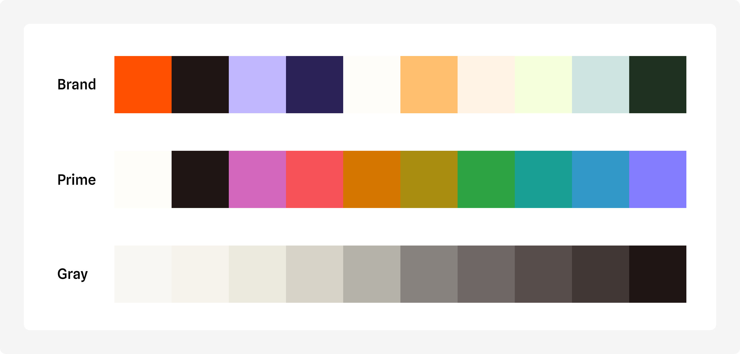
Refreshed color palette in collaboration with working group
Solution
The Editor should look and feel more like an interactive canvas tool
I finally landed on a design that resonated with users and stakeholders alike. I wanted to imbue the interface with greater flexibility and control, all while enabling users to configure their space in a way that best suited their needs.
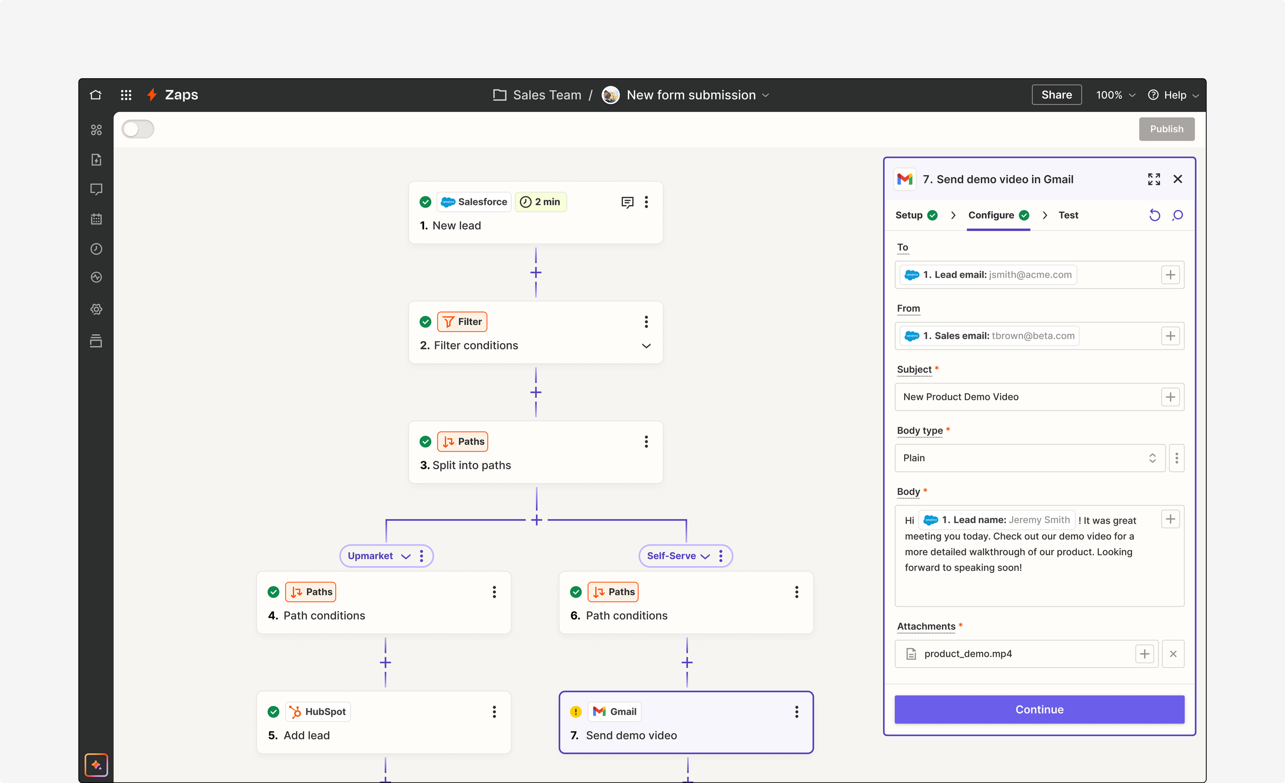
The old Editor was dominated by two sidebars, leaving little room to view the workflow diagrammed. It felt rigid and burdensome, and took users away from the building space. By floating the right sidebar, we created a better relationship between the step cards and its details. The purple outline and fill of the step card (when selected) matches the header of the step details, further connecting these surfaces. This unites step-level information. In contrast, we joined the top and left sidebars by a dark black border, which better represents actions at the Zap-level.

Zapier’s redesigned Editor

Large Zap with many paths using the condensed menu view
Focus Mode in the Editor
Users can now also adjust both the height and width of the sidebar to configure their Editor experience. I saw this as essential for managing larger Zaps, especially for seeing more steps and path branches. Even more, I introduced Focus Mode, an enlarged modal optimized for information-dense views. Users noted this would be helpful for large text fields, mapping data, and testing steps.
Introducing a refreshed identity for visualizing workflows
Our step cards represent how all the individual apps and tools used in an automation are connected. I wanted to establish a clear hierarchy of information to allow users to better parse large Zaps. I rearranged and simplified elements on the step cards, as well as brought additional controls onto each card.
Before and after of card styles
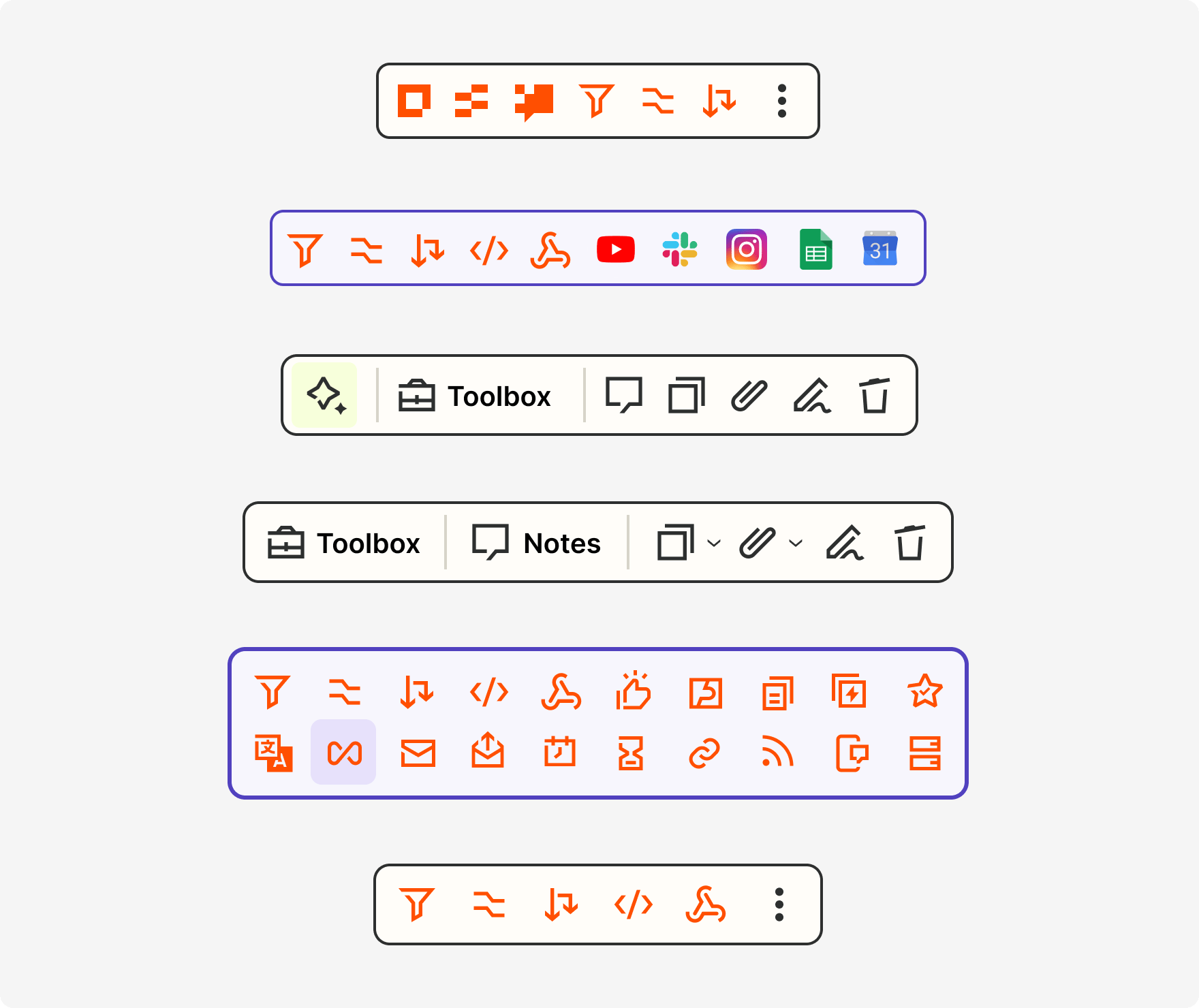
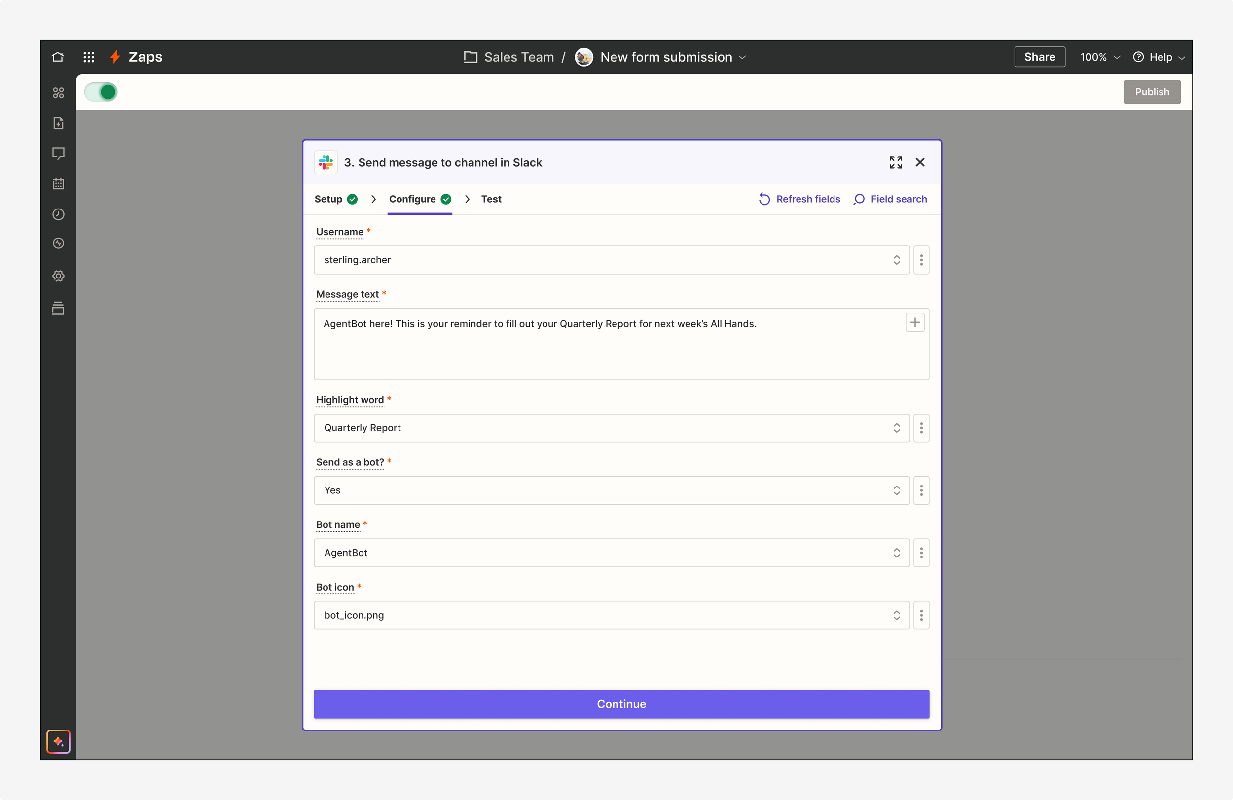
Moreover, I wanted to better distinguish Zapier products and built-in tools from third-party applications. Doing so presented a key brand opportunity to highlight our suite of offerings, especially as recent changes to our pricing model had made a number of these free from task usage. Each app pill and icon associated with Zapier now an orange border and fill. Other Zapier tools, like Filter and Paths expand to reveal more details about that individual step.

Distinguishing Zapier products and built-in tools via color
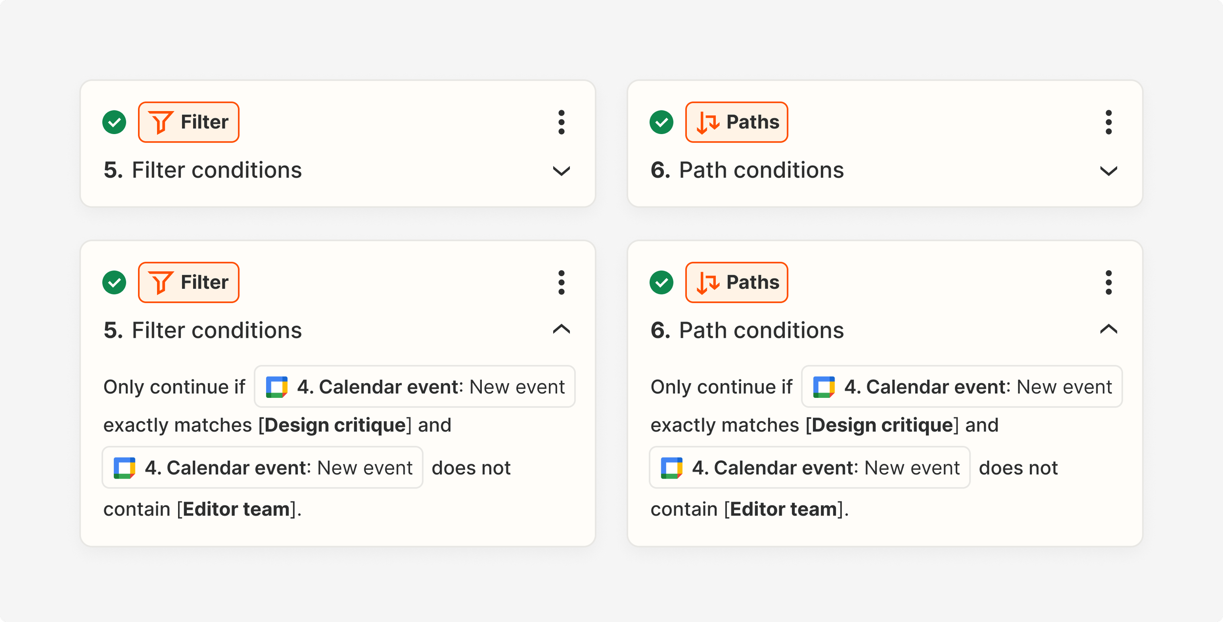
Expanded cards for certain Zapier built-in tools, like Filter and Paths

Sample of the various permutations of card styles possible across all apps, tools, products, statuses, modes, features, and functionality
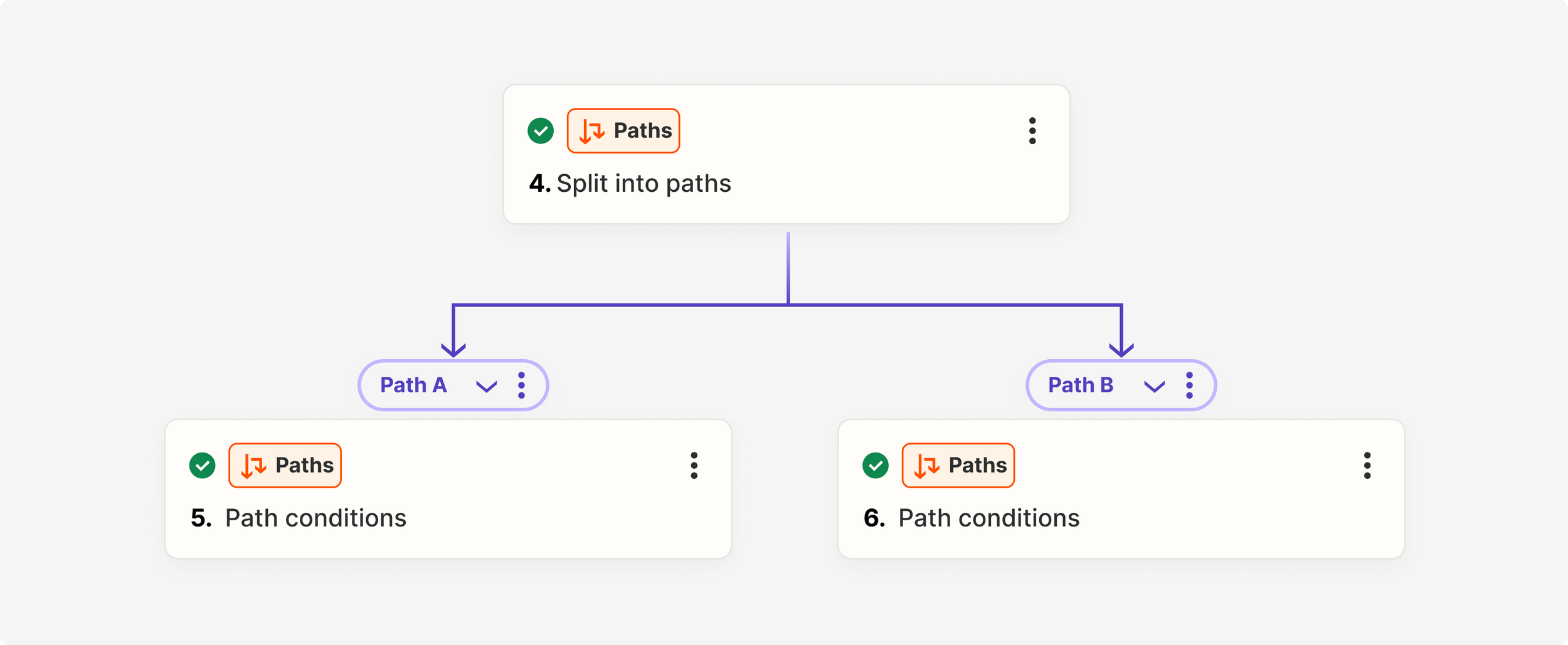
Default view of a Path branch
I also re-imagined the arrows and connectors on the canvas that unite these cards, as well as path branches. They were stylized with a slight gradient, one that affords a sense of movement without the drain on performance via actual animation.
Detail of arrows in Edit mode
Detail of connectors in Publish mode
Rethinking information architecture and usability patterns, plus some much needed tidying
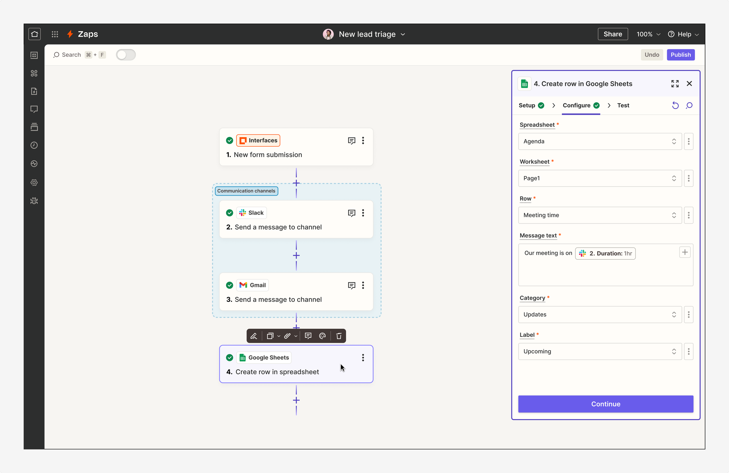
I moved to a tabbed orientation to better indicate the sequential nature in which Zaps are created and consolidated the grouping of steps. The shift away from the old vertical accordions saved precious space in this panel and reduced the number of clicks to build.
Before and after of the right sidebar where users configure their Zap
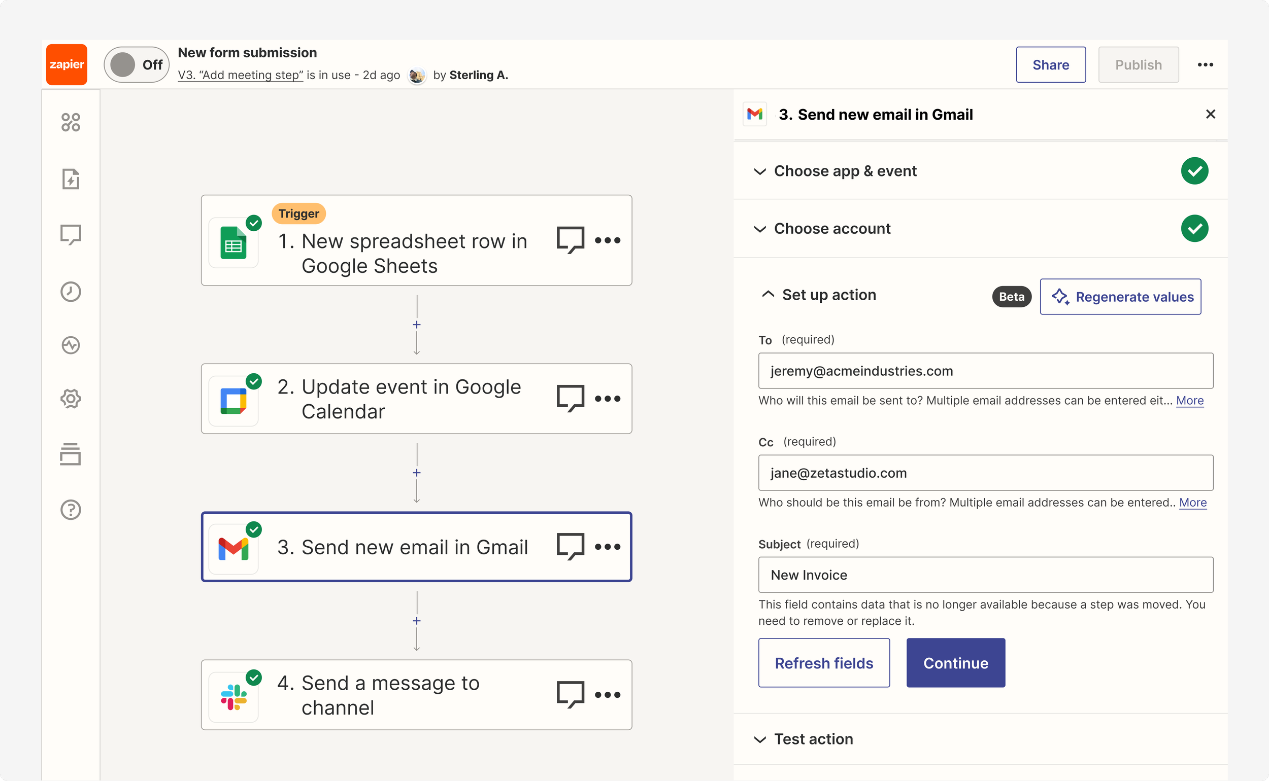
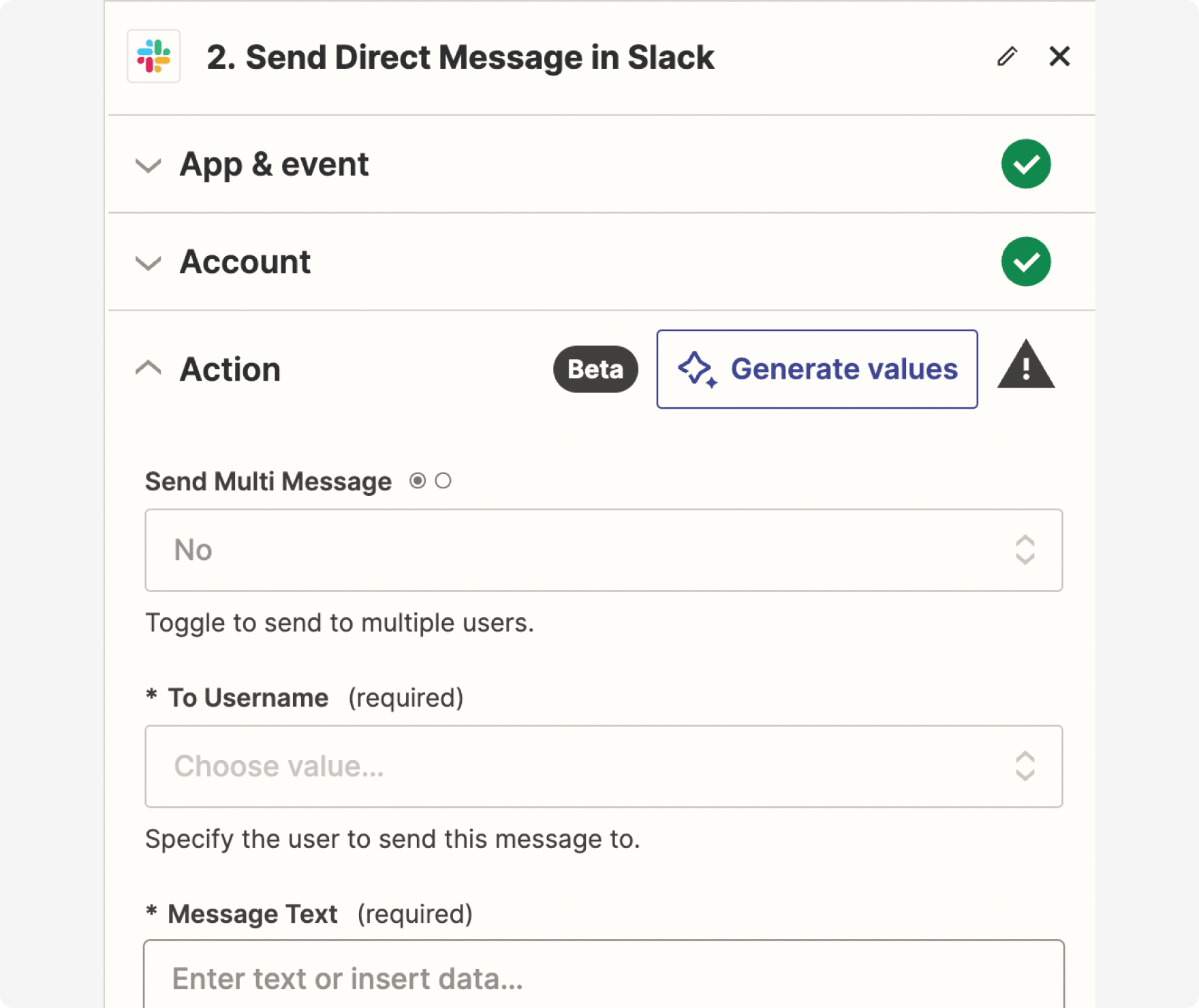
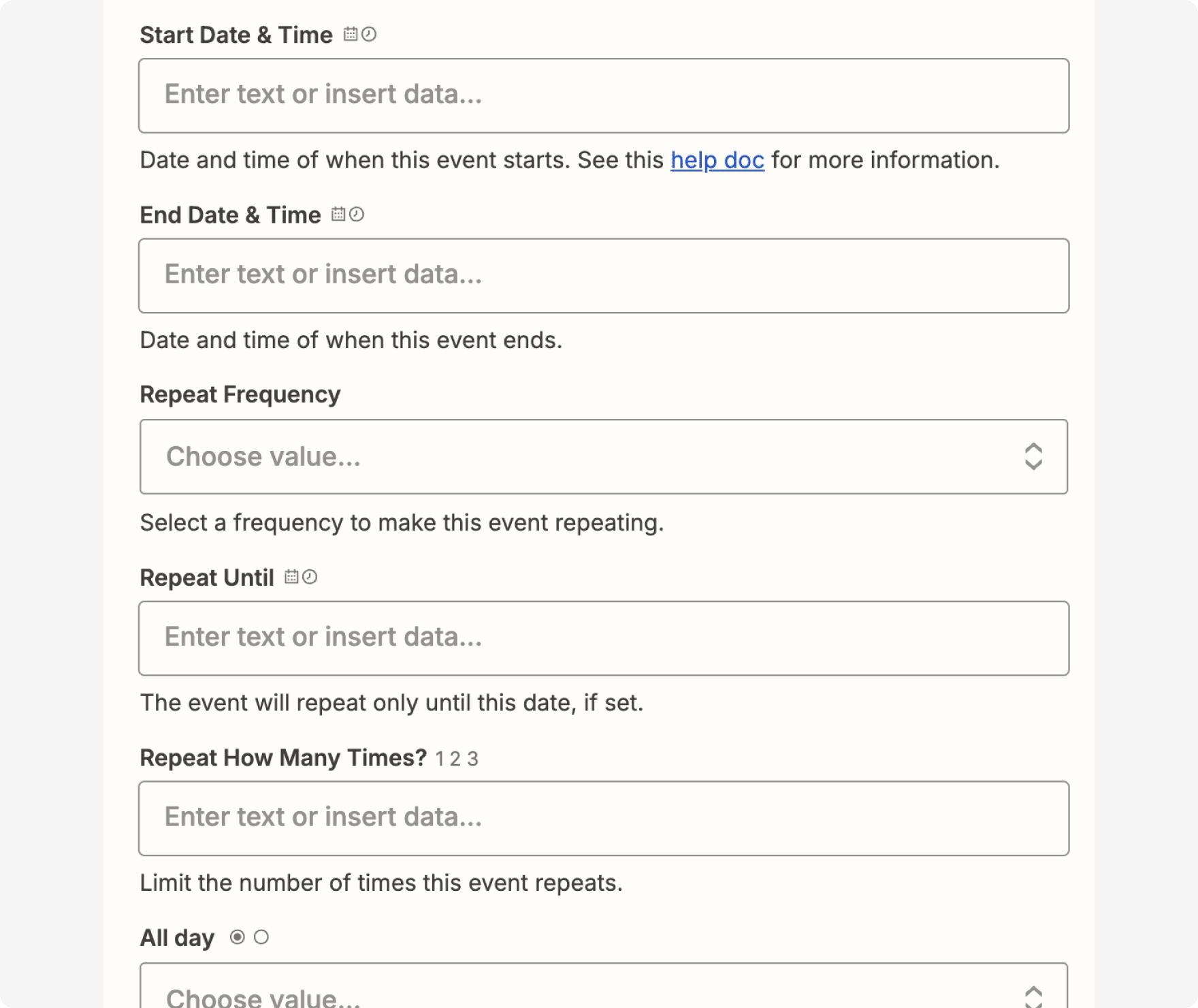
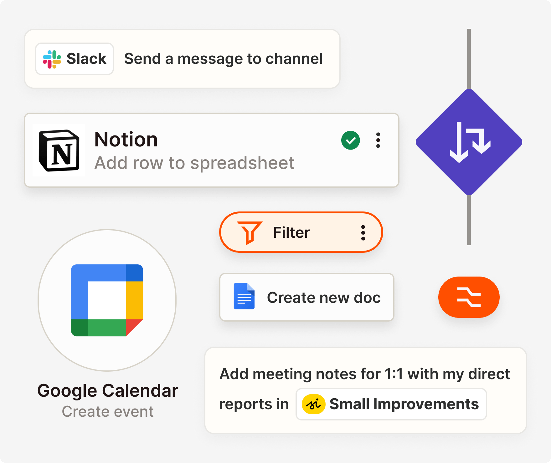
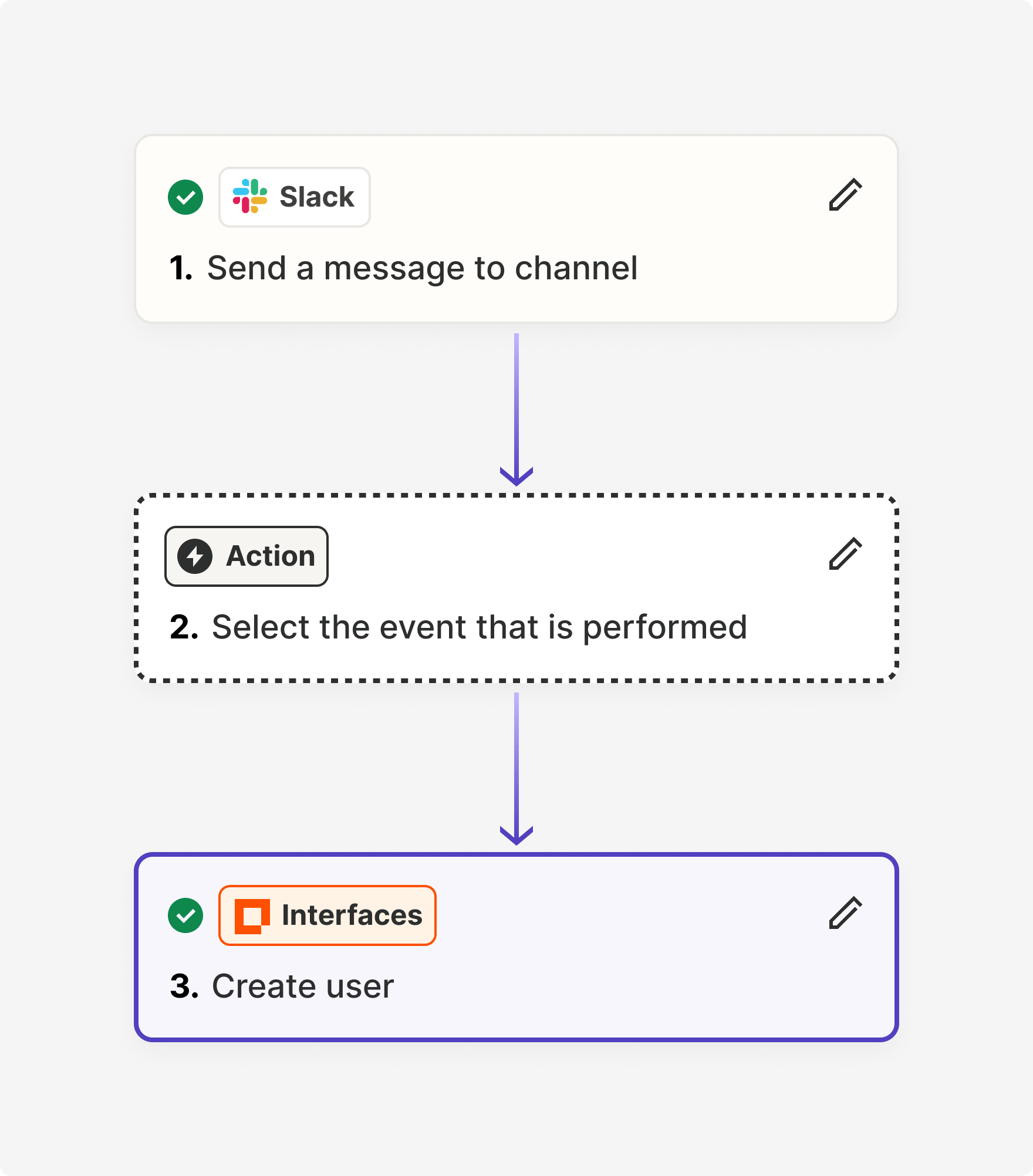
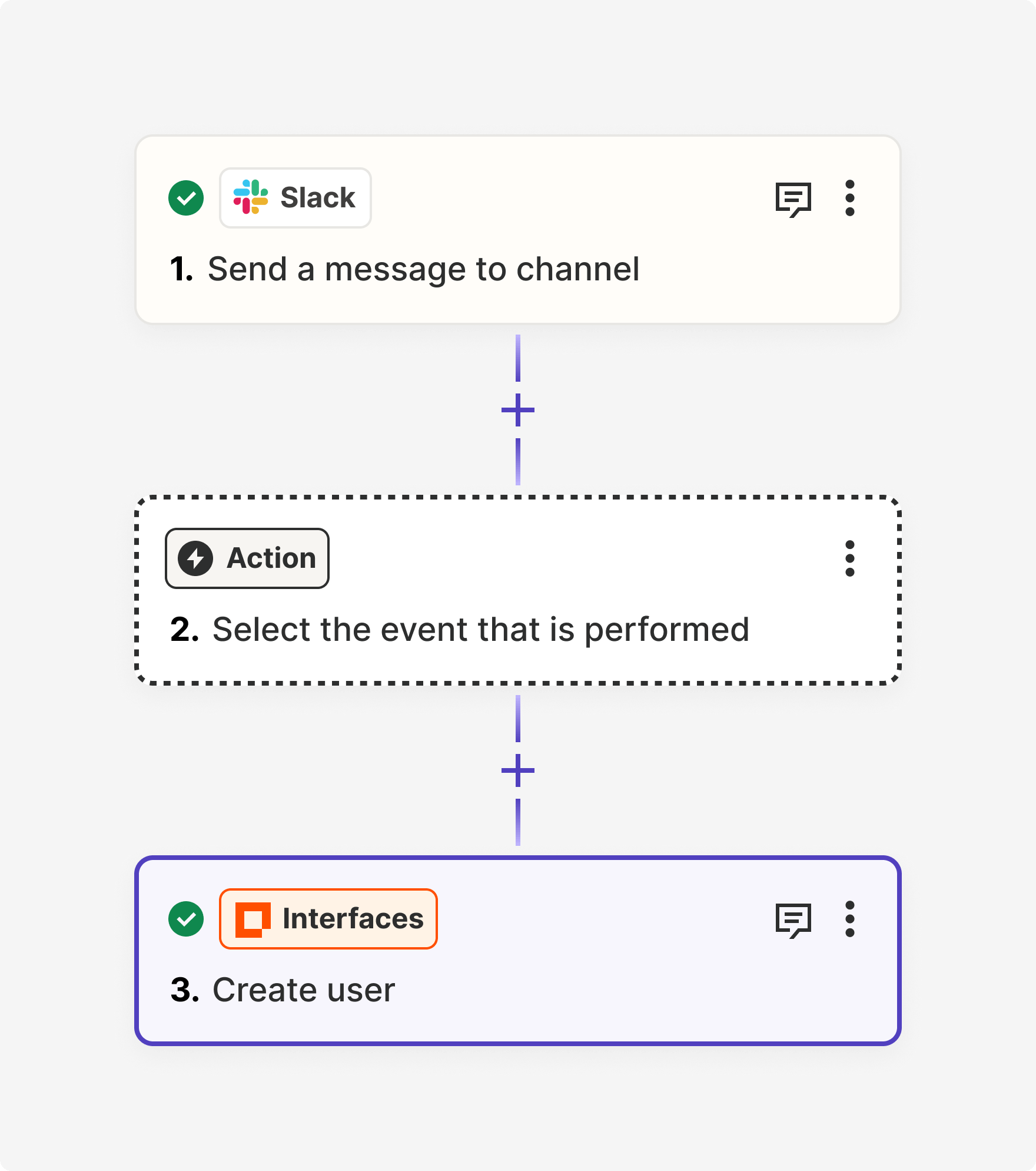
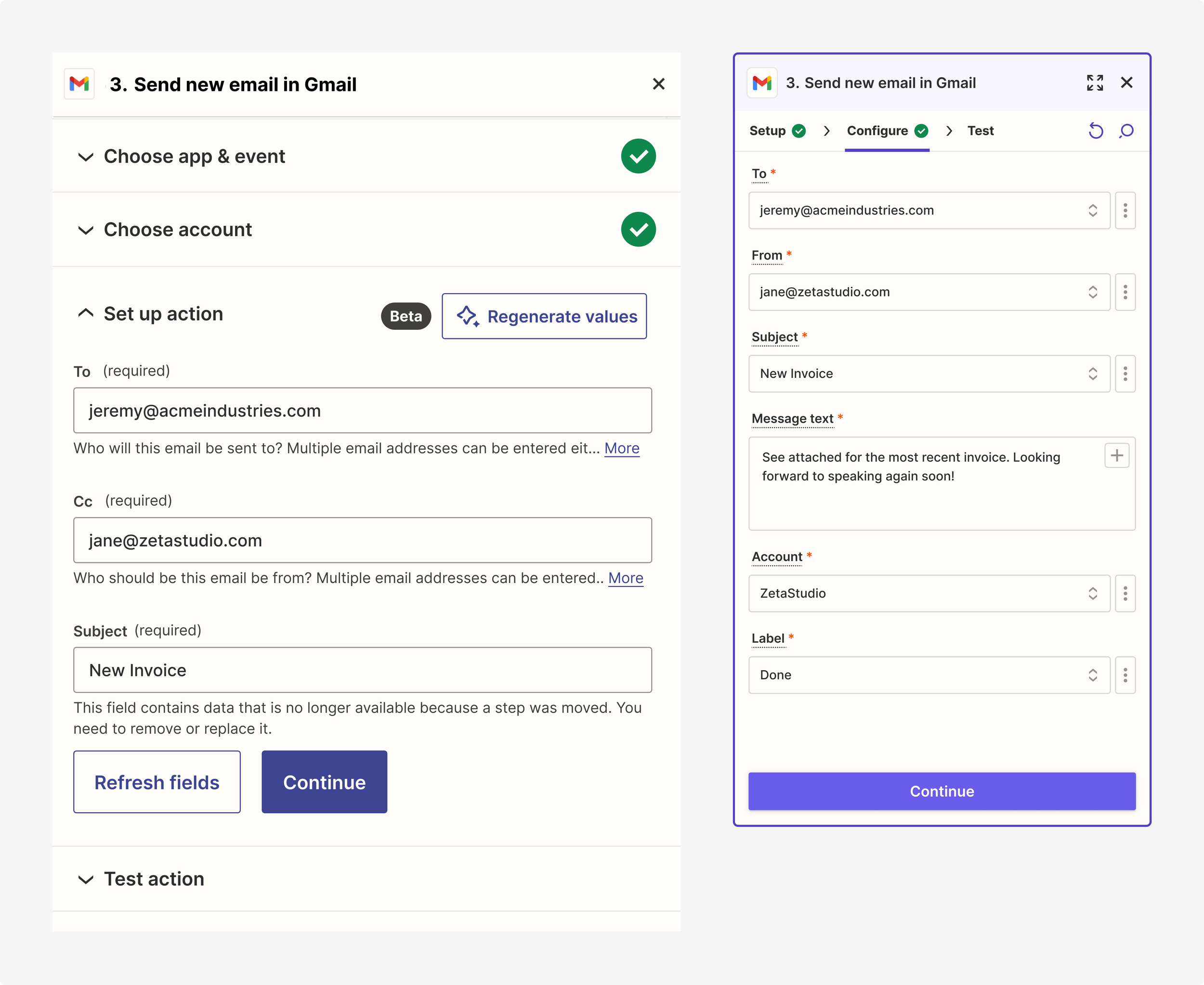
The old dropdowns were difficult to parse and overlaid the right sidebar, obscuring the fields below. They would also open whenever a user clicked within the field, which was unnecessary and confused a lot of users. The new designs allow for the menu to swing out onto the canvas and adjust the width, providing better use of space for field mapping data, authentication, and long lists of choices. The new plus icon within the field summons the dynamic values menu intentionally when clicked.
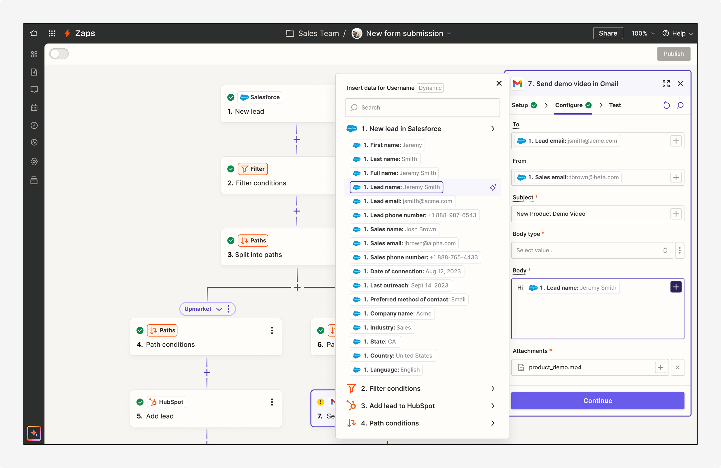
The new swingout menu in context of the overall Editor
New swingout designs, applied to account and choice selections

New swingout designs, applied to “gives” menu for field mapping and data insertion
This side panel originally felt as though every feature, as well as all the information, announced itself. I wondered what could be hidden (and revealed through progressive disclosure) and what could be removed entirely. What was crucial for building a Zap and what was more of an advanced feature? De-cluttering initiatives included moving lengthy helper text beneath each field into tooltips, establishing a smaller type scale for better hierarchy, condensing components and spacing, and removing unnecessary tags, labels, and icons.
Detail of helper text in a tooltip (instead of below the field)

Detail of shortcut for field mapping
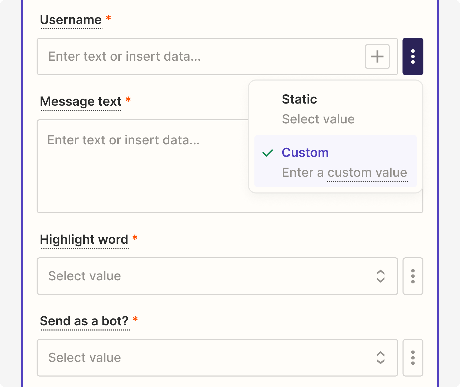
Detail of switcher for static and custom values
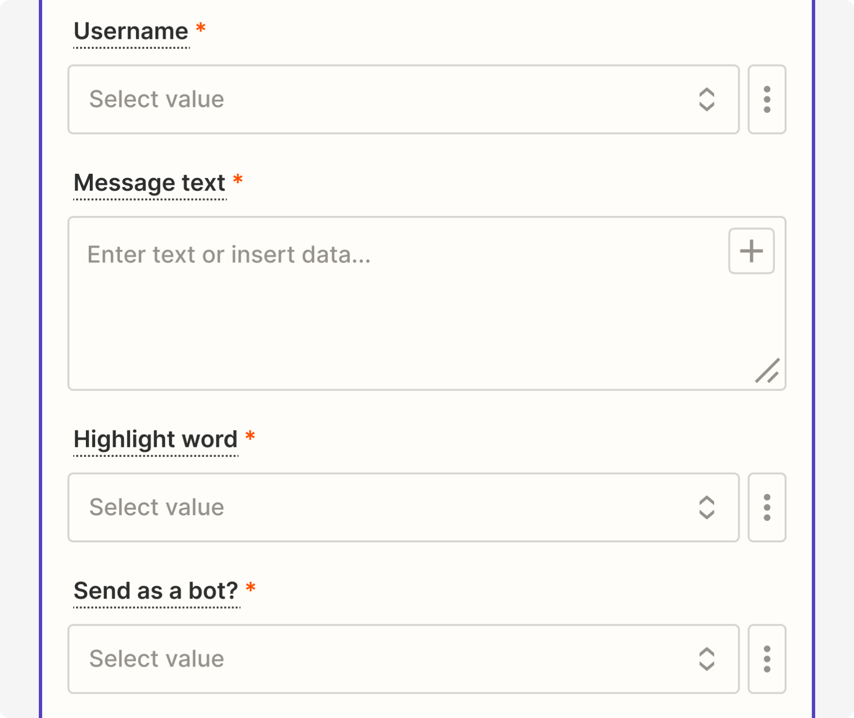
Detail of expandable input field
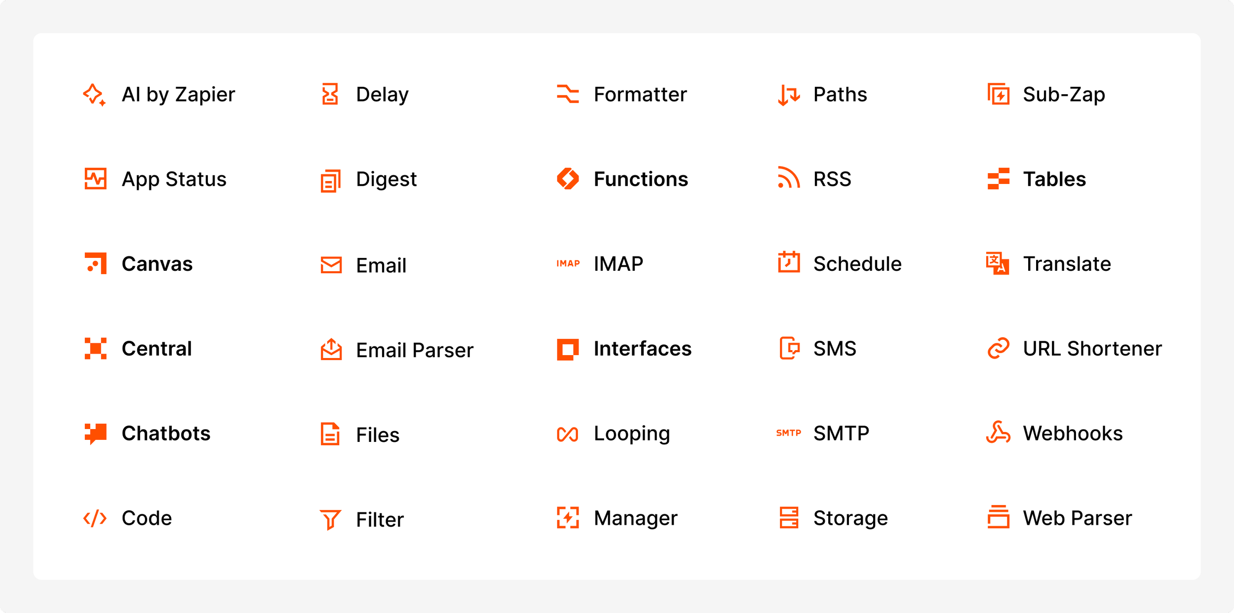
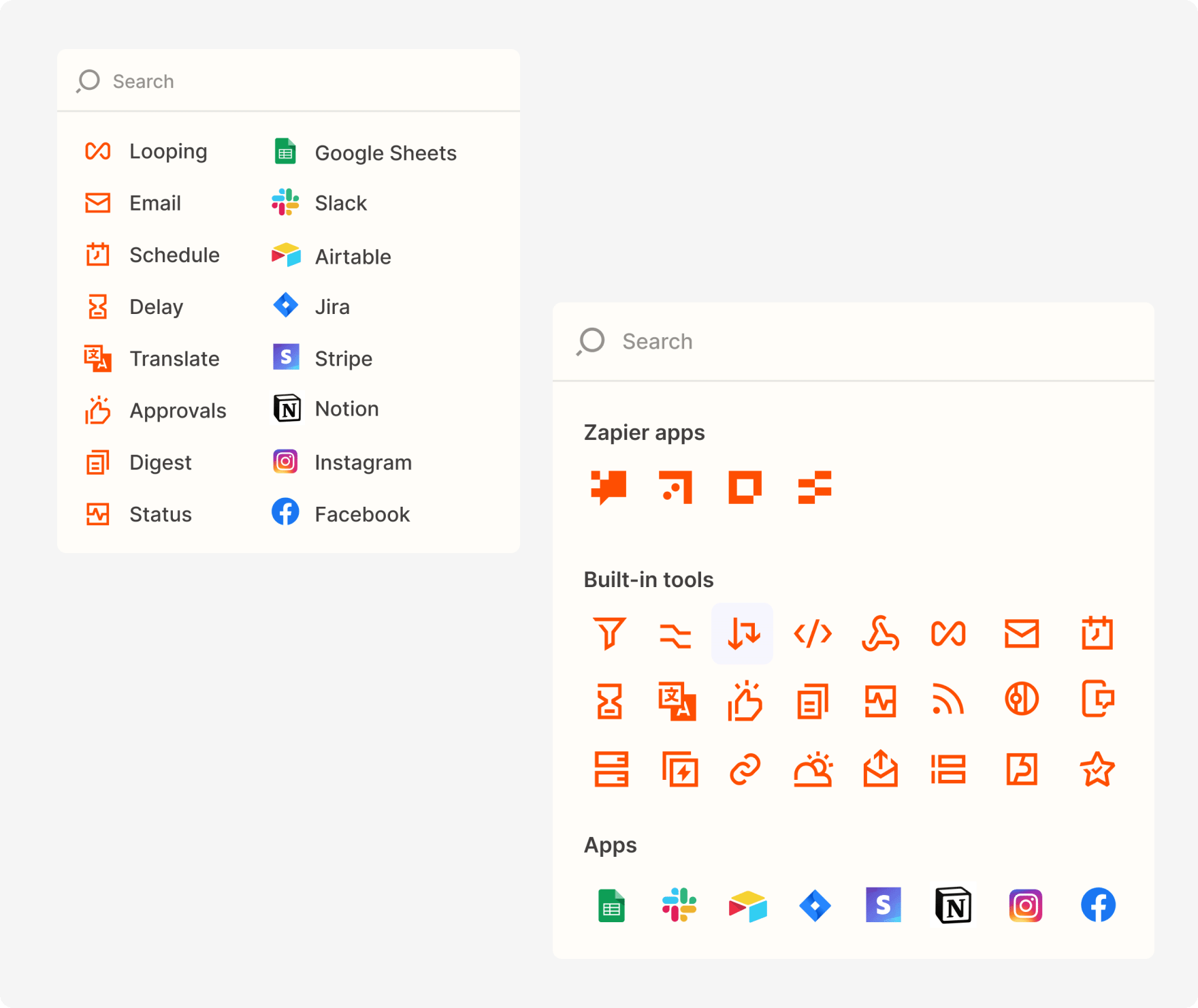
A new app picker designed for quick access and better discovery
The new app picker reimagined the default Home screen with a list of recently used apps and built-in tools, reducing the need to search and browse. The average user employs 7 apps in a Zap, with only 6.5% of accounts using 20 or more apps. As such, I designed the new Home to accommodate 12 apps, 7 built-in tools, and 3 Zapier products.
Before and after of the app picker, home
New app picker modal in the Editor
Similar to the step card styles, the navigation menu beneath the search bar distinguishes Zapier products (Tables, Interfaces, etc.) and built-in tools (Filter, Formatter, Paths, etc.) from third-party apps. Clicking those shortcuts reveals all associated apps and tools with descriptions to better understand their use. These categories reinforce the suite of Zapier products available to users. Beneath each navigation button lives additional subcategories, which encourages browsing and can scale to accommodate future needs.
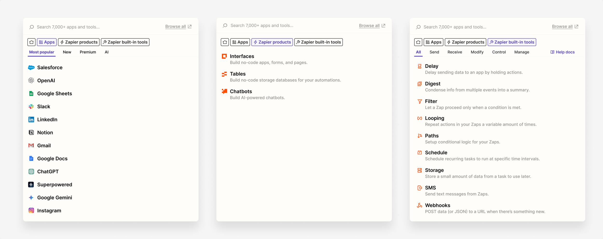
Three main tabs besides Home: Apps, Zapier products, and Zapier built-in tools
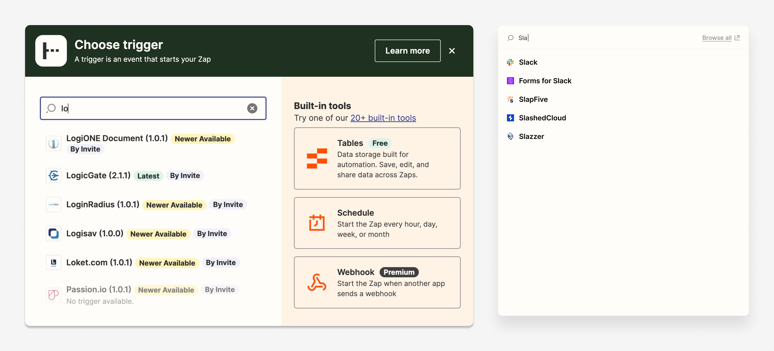
As with all other portions of this redesign, I worked to reduce clutter. For example, certain apps had multiple versions, all of which existed without organization when searching. I introduced an accordion to display the most recent version of the app, with the ability to select a previous version if needed. Doing so also eliminated the need for additional distracting labels.

Before and after of the app picker, versions
Before and after of the app picker, search results
Impact
The Editor redesign saw noticeable improvements in key success metrics
We saw about a 5% increase in Zap creation completion post-release, a metric that has been notoriously difficult to budge. Moreover, there was about a 4% increase in the percentage of users adopting Zapier’s built-in tools, highlighting our impact on their discoverability in the app picker. We also tracked the redesign’s success via qualitative voice of customer reports. In the quarter post-launch, there was an 127% increase in positive-sentiment comments about the general ease of creating a Zap in the Editor.

We were further delighted by positive social media buzz and comments from power users in our early access program Slack channel. The redesign was highlighted at ZapConnect, Zapier’s annual user conference, as well as featured in the Developer Keynote at the 2024 Google I/O conference.
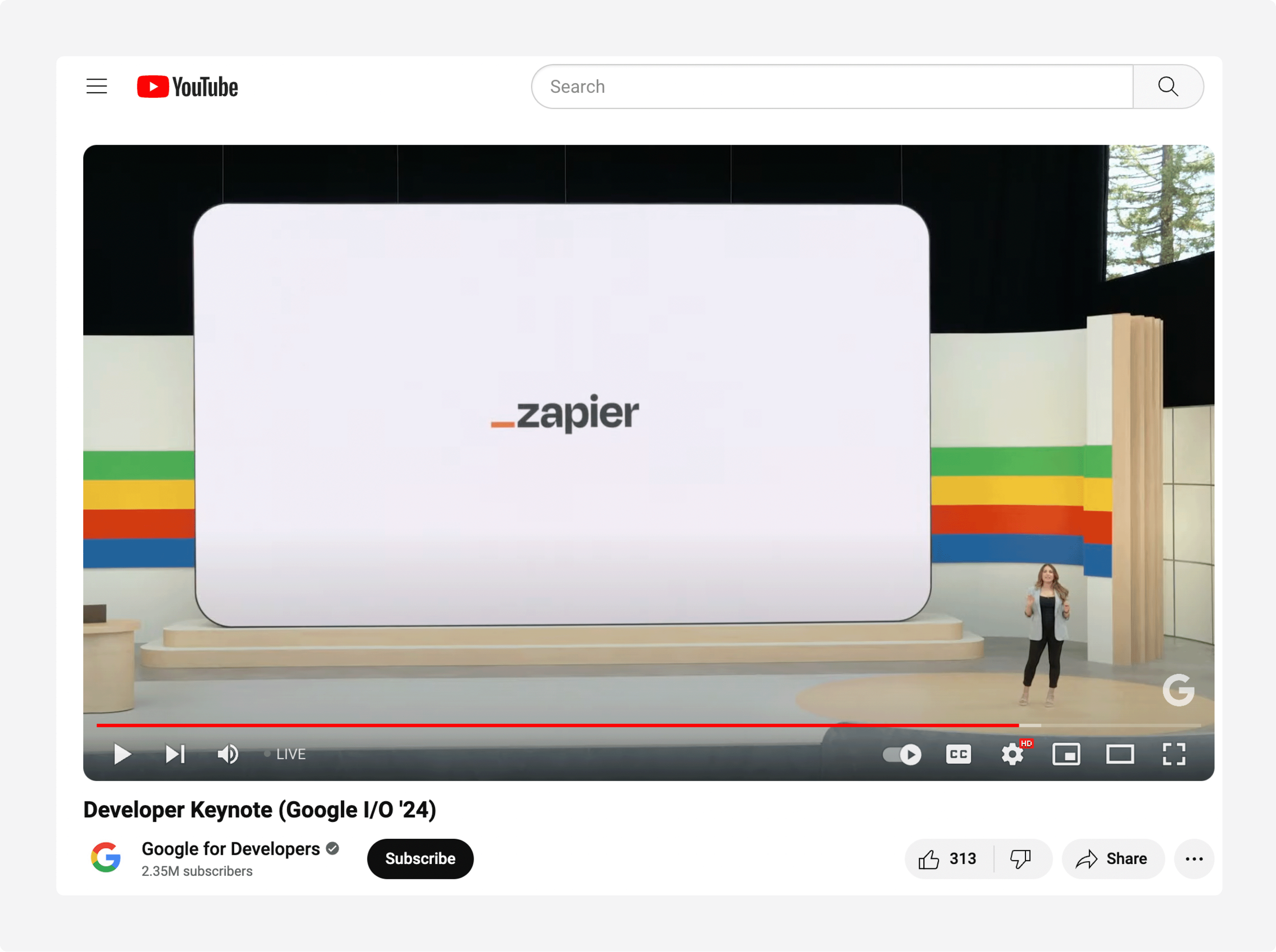
Zapier’s new Editor previewed at the 2024 Google I/O conference
Next steps
Building on our new foundation with continuous improvements
The refreshed Editor raised the quality bar for our products across the organization. Other products, including Tables, Interfaces, Canvas, Chatbots, and Functions, will adopt these patterns for a cohesive experience. The design system also plans to codify many of the new styles featured above.
Building on this foundation, we have plans to expand quick access to apps via an on-canvas toolbar, implement the ability to favorite apps and events in the app picker, and further enhance interactivity and flexibility in the Editor.
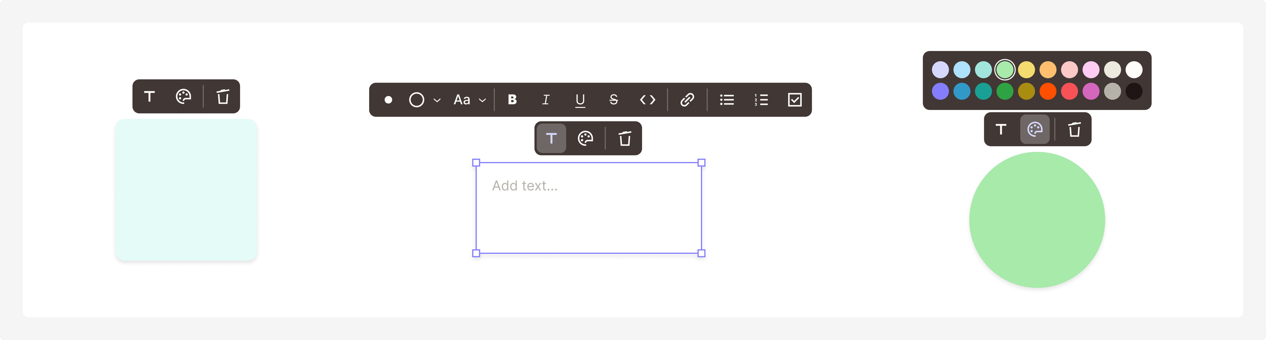
Concepts for flexible components, including customizable sticky notes, text boxes, and shapes
Concepts for groups of steps and on-canvas controls for nodes